BBC Studios
VISUAL & SONIC IDENTITY
After a period of reshuffling and government charter negotiations, the BBC merged its two flagship commercial arms — BBC Worldwide and BBC Studios — into a single licensing, production, and distribution powerhouse.
This move prepared the BBC against a new wave of fierce rivals at home and abroad, and to maintain its soft power globally.
5" STING: VISUAL AND SONIC BRANDING
The challenge? Develop a new positioning and identity worthy of the BBC’s creativity and expertise, enhance its international reputation and keep generating revenue to help fund the BBC at home.
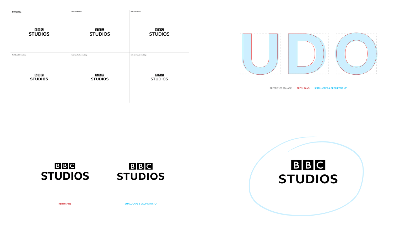
It was the first logo to incorporate the BBC’s new typeface, Reith. We used small caps and a custom ‘O’ to mirror the circular brand elements.
Sound artist Matthew Herbert came on board to help us craft the audio branding for the BBC Studios Sting, which uses his own archive recordings taken from the BBC.
SEQUENCE OF STING VARIANTS: 3", 5" & 10"
MY ROLE: CREATIVE DIRECTOR, DESIGN DIRECTOR, BRAND STRATEGIST
BEFORE
The previous logos each had a different typographical approach and style.
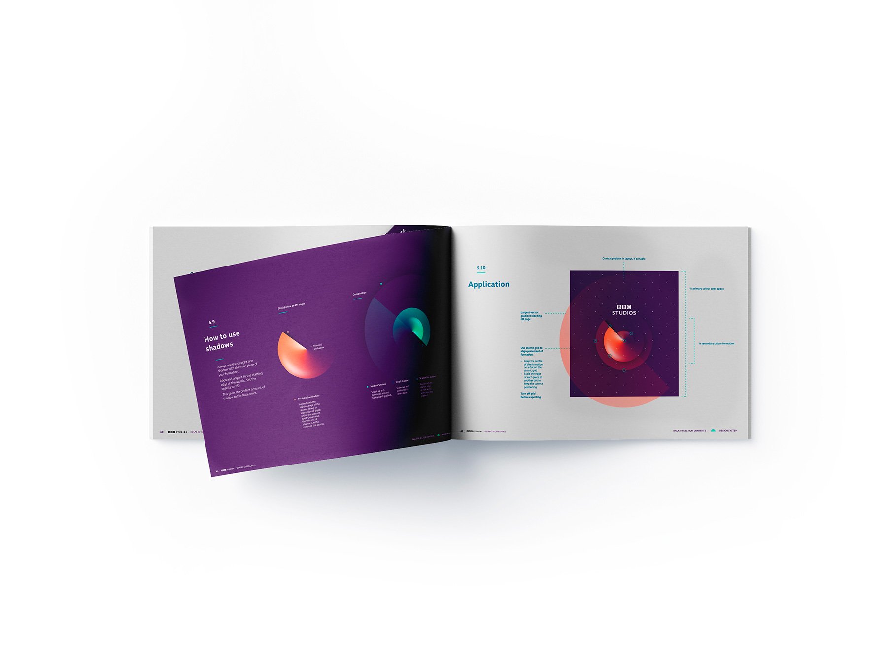
Studios had few brand assets, so we built upon my previous project rebranding Worldwide, which drew inspiration from the Atomic Dot pattern on Television Centre.
AFTER
Small caps in BBC Reith built a sturdy counterpoint to the BBC blocks, and a custom rounded 'O' integrated seamlessly with the design system.
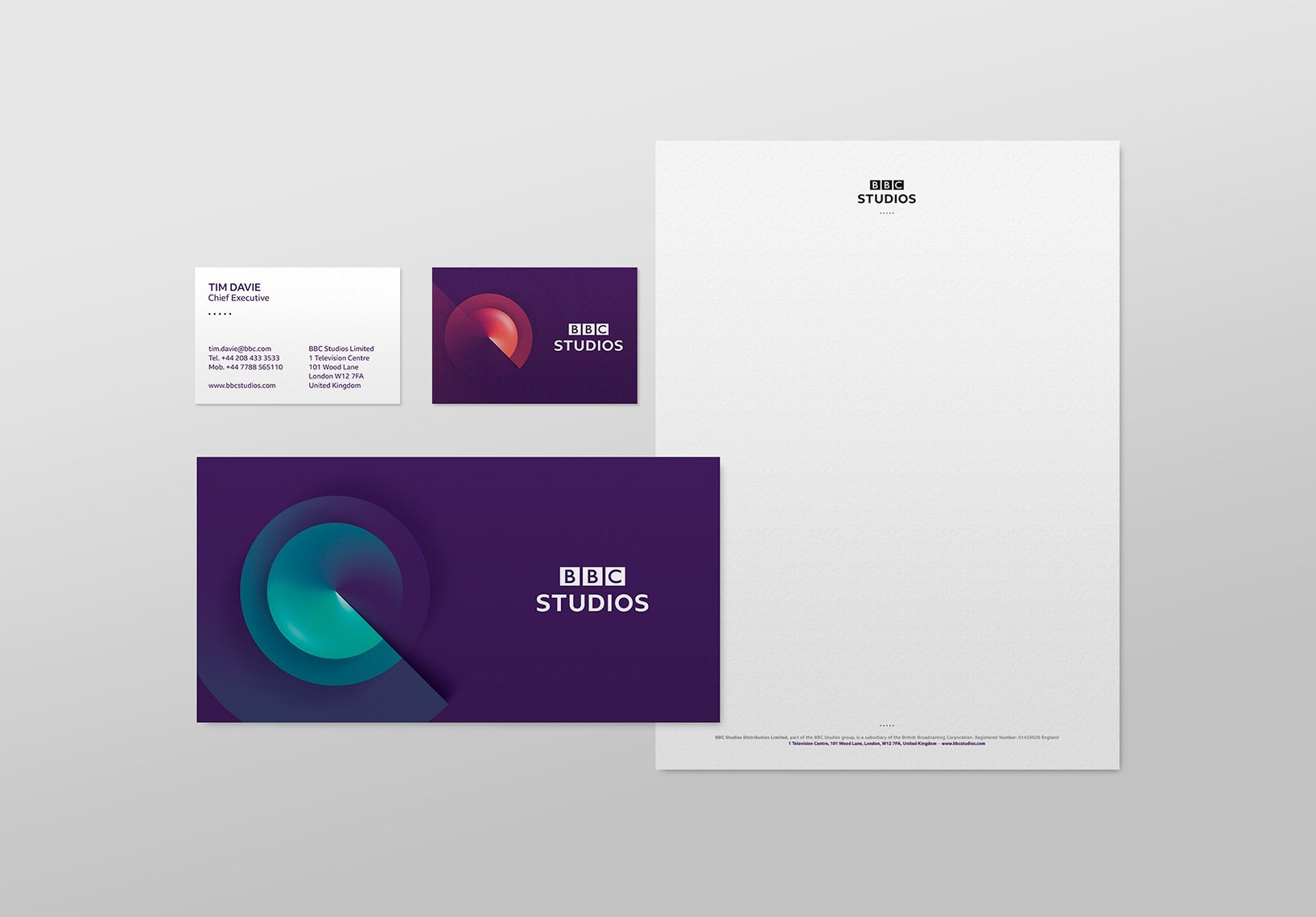
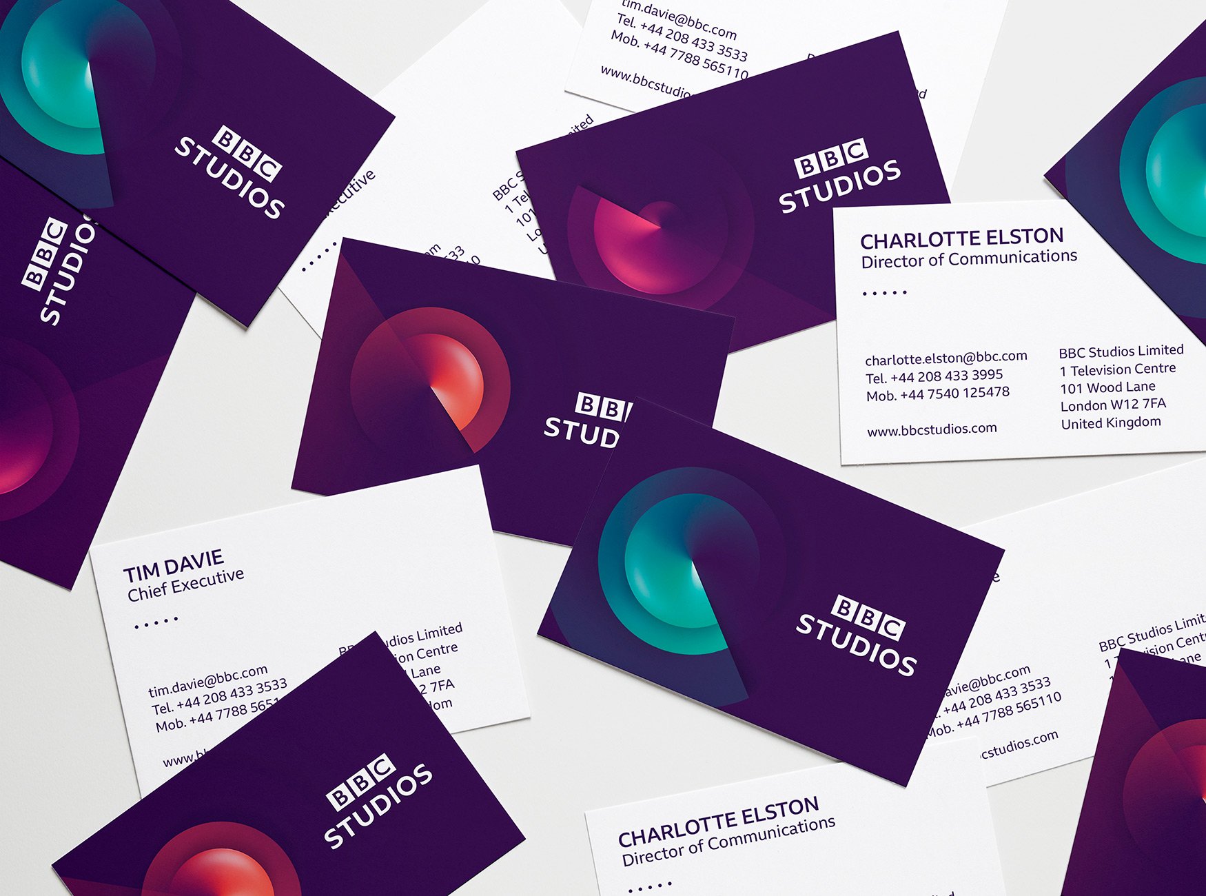
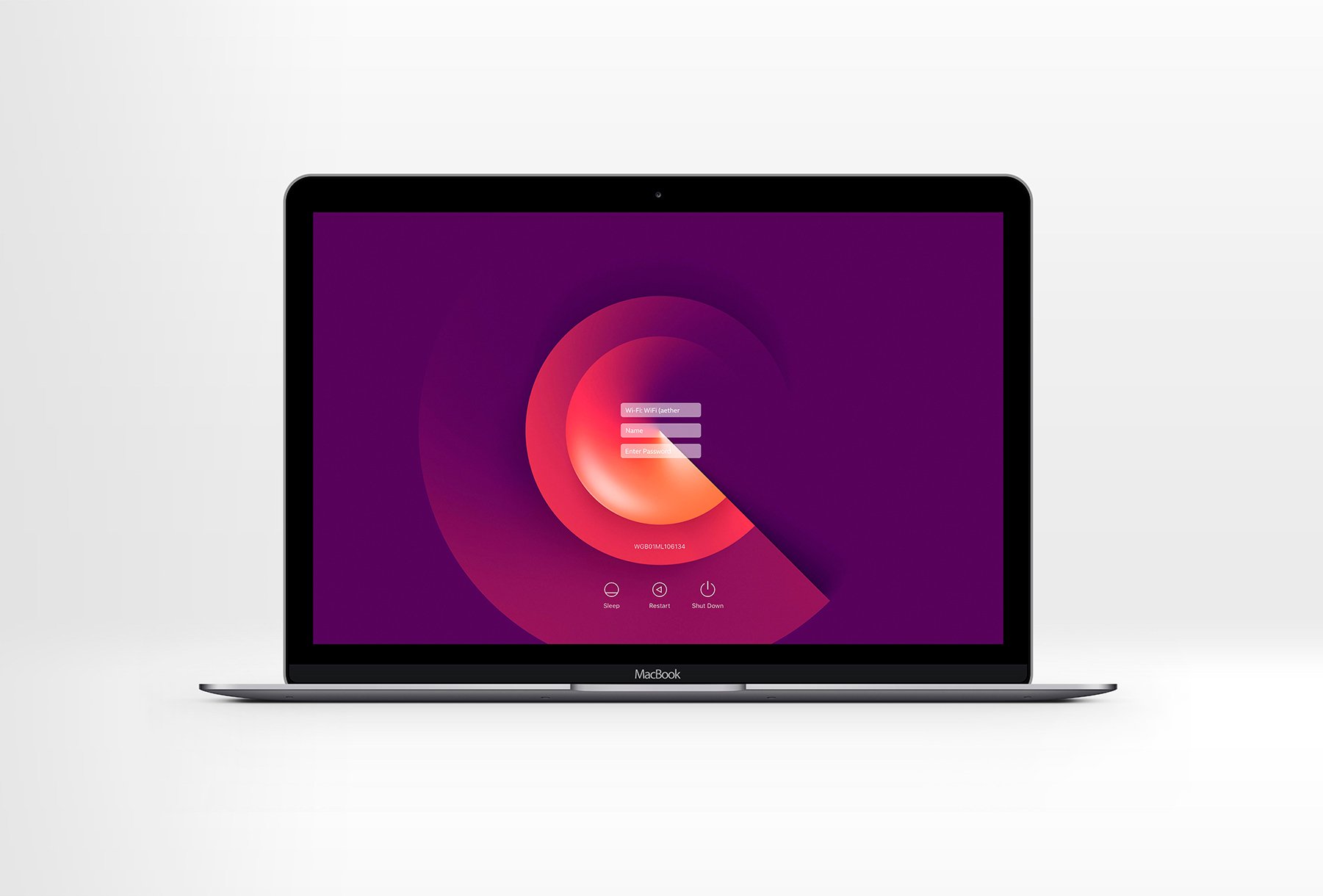
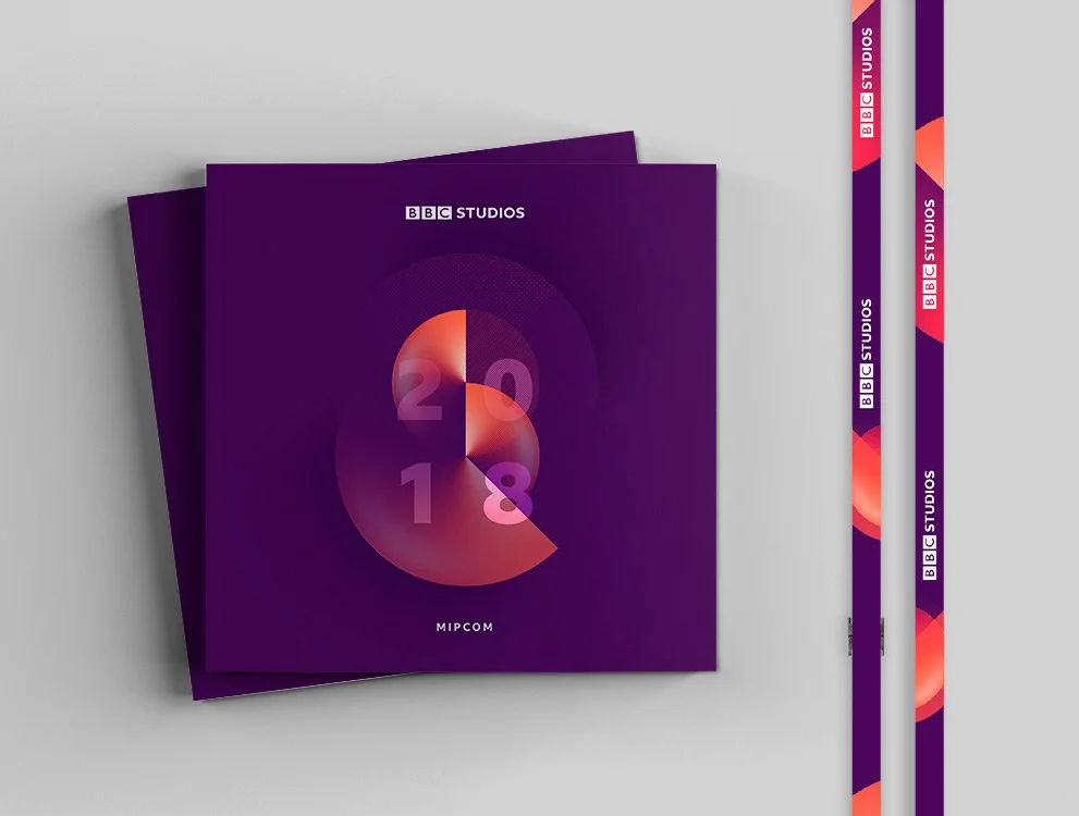
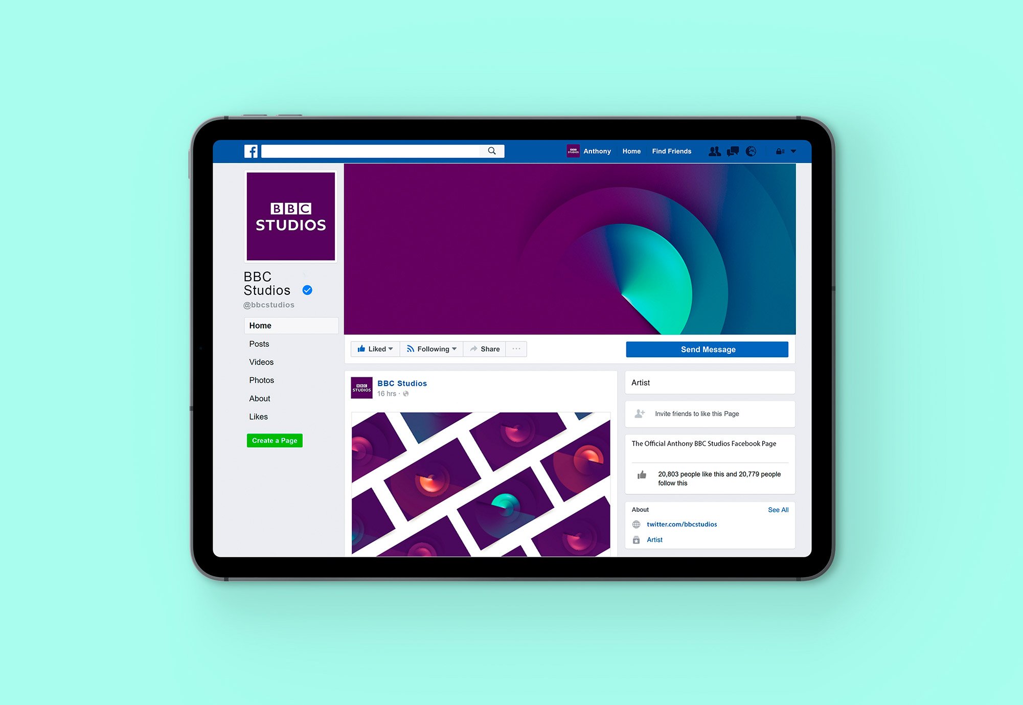
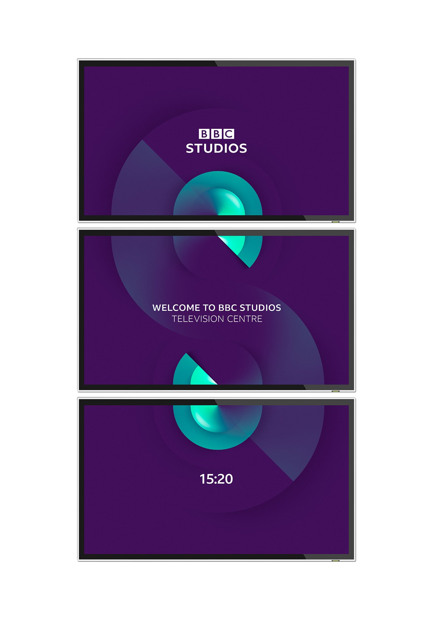
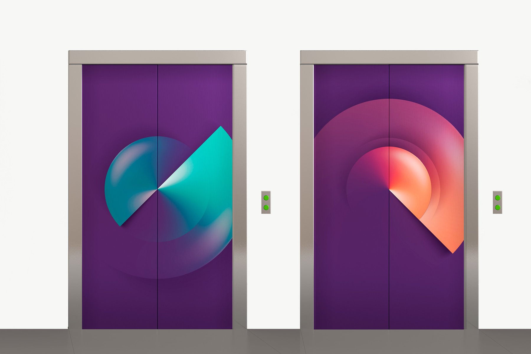
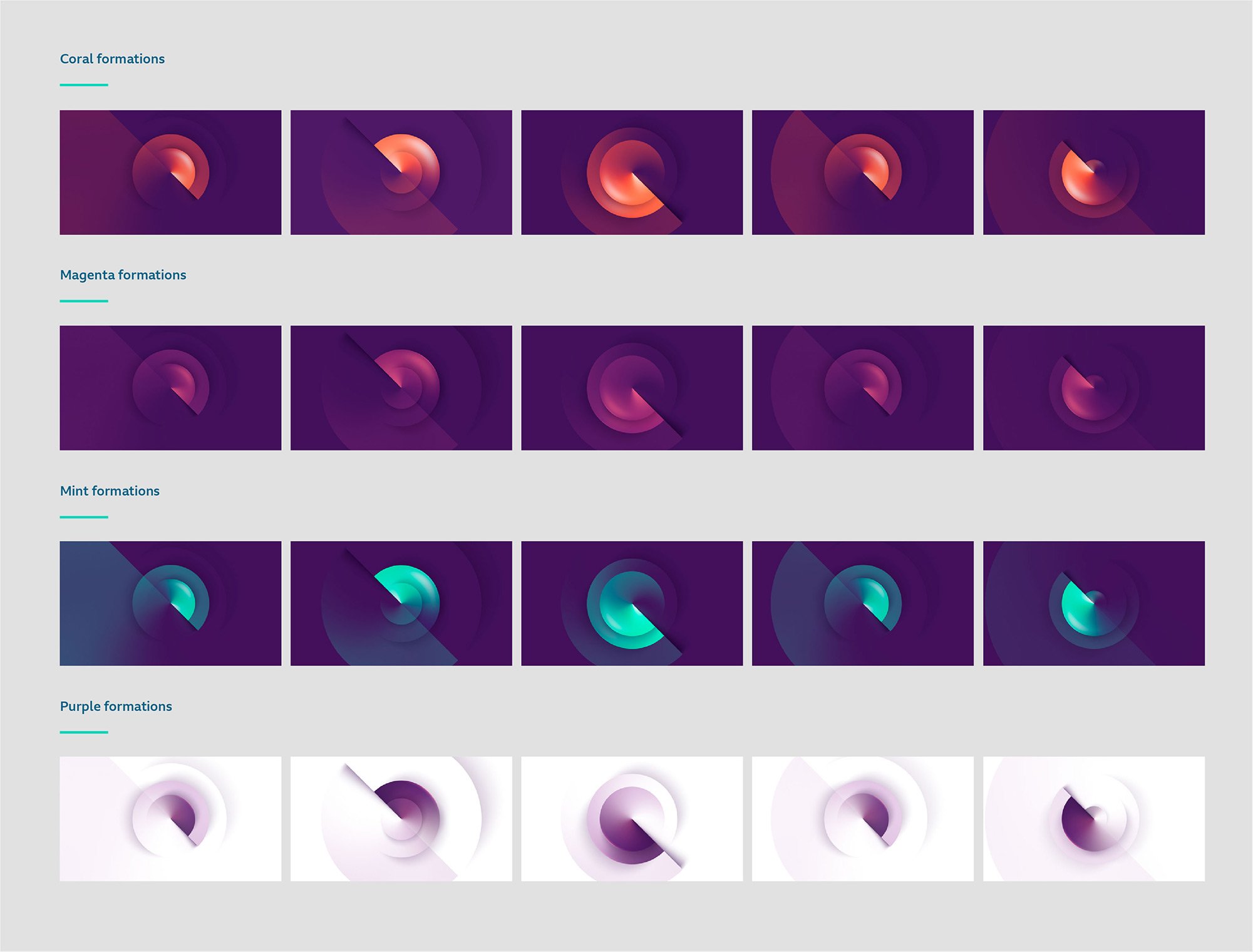
The ‘atomics’ symbolise a sophisticated, restless creative energy — the dynamic, transformative power of storytelling. Multiple forms of the atomics adjust the brand’s presence across genres.

“The key ingredient for a project of this size was Gavin’s ability to define and articulate the strategic DNA of the idea. This provided real clarity and focus to all aspects of the design identity, which was so critical to its success and rollout.”
Nick Meikle, ECD
BBC Studios Creative


