Doctor Who
REBRAND & LAUNCH
When Jodie Whittaker was announced as the first female Doctor, it marked an iconic moment across space and time.
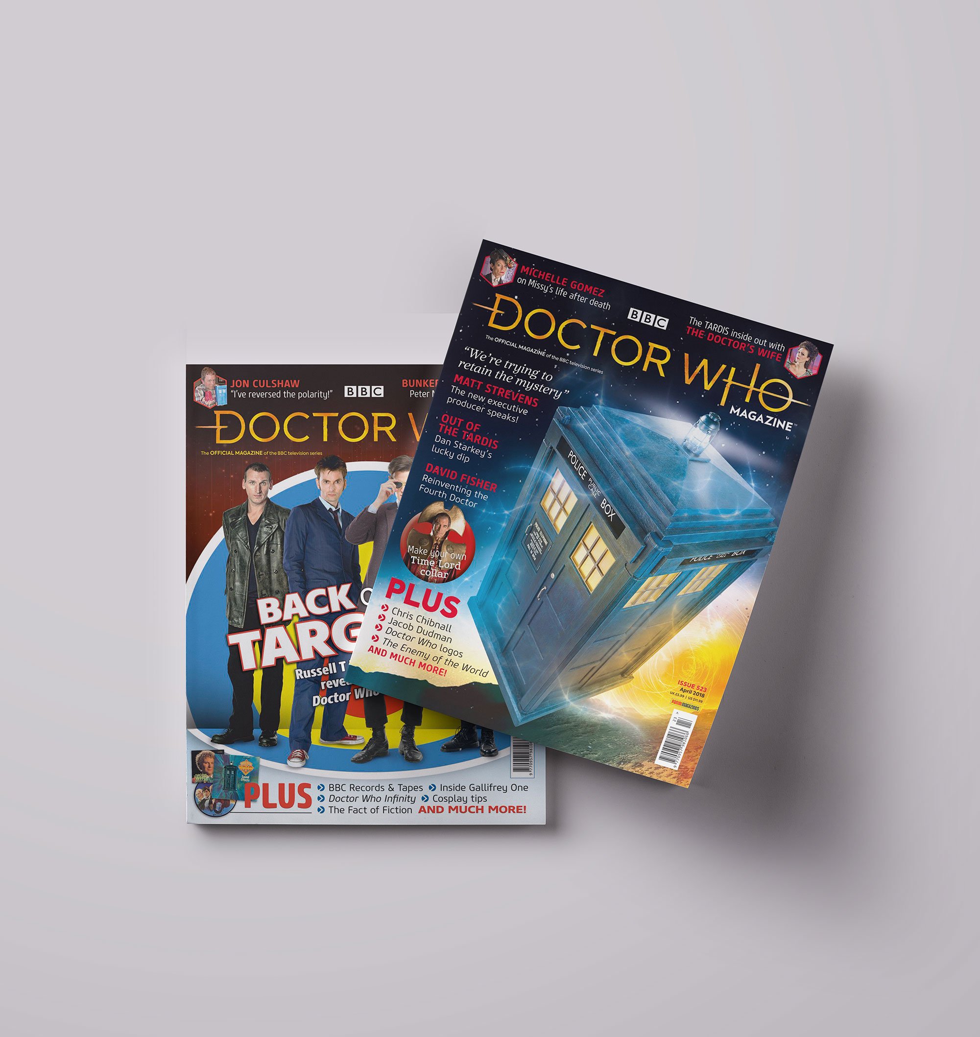
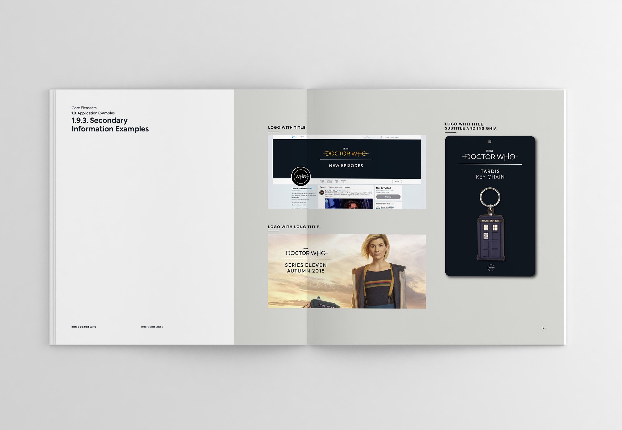
Throughout the show’s rich history, new logos typically arrived with each regeneration. But this time, we were to build a cohesive brand across the board — for all Doctor Who merch and platforms — bringing consistency across global markets and legacy content.
Matthew Herbert crafted the sonic identity. Inspired by the BBC Radiophonic Workshop pioneers, he used reality-bending techniques to capture the sounds of time, space, and nature.
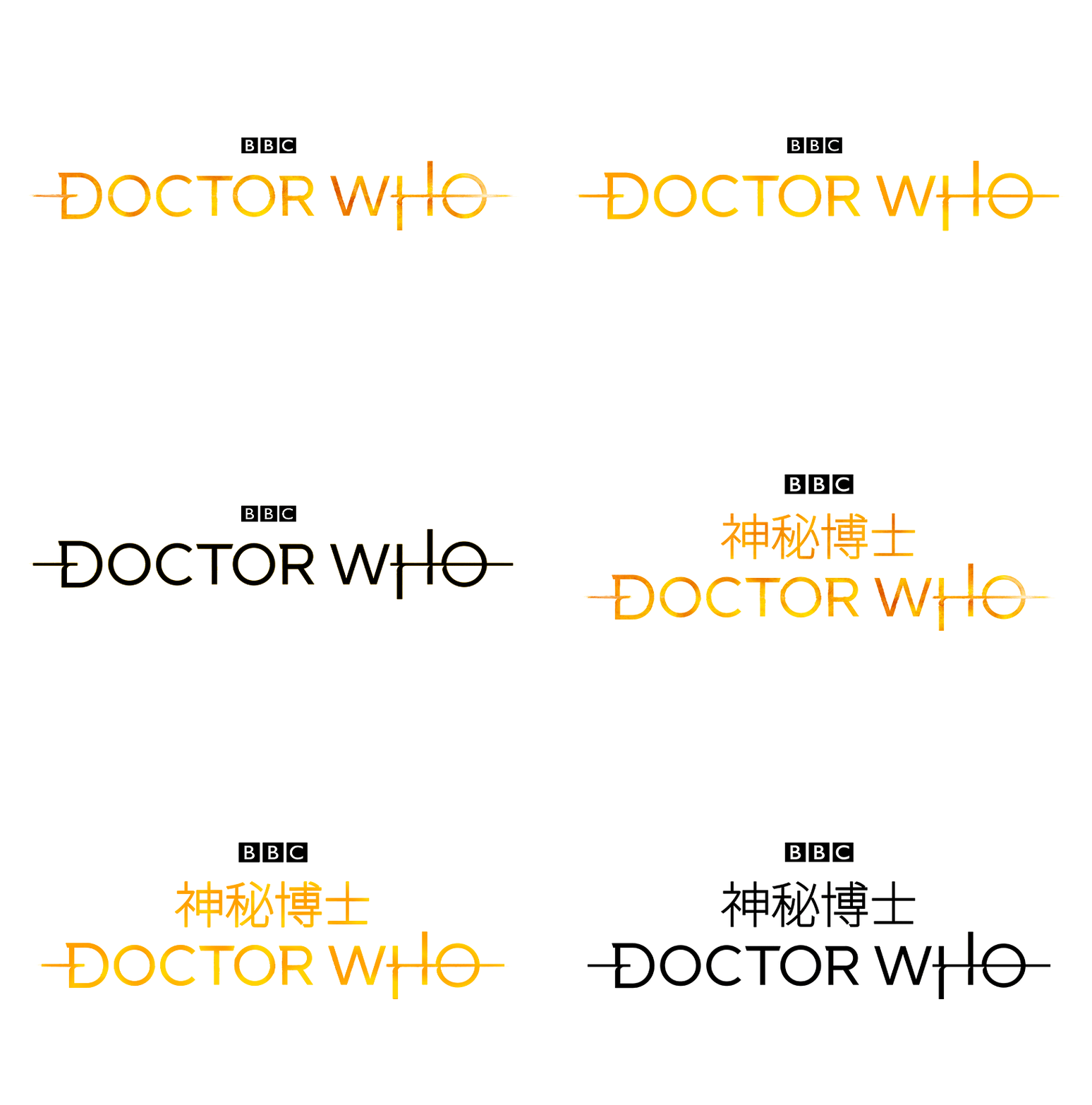
The handcrafted logo’s geometric lines lend a crisp, modern feel, with distinctive angled slab terminals. Crossbars reveal the TARDIS blasting through time and space.
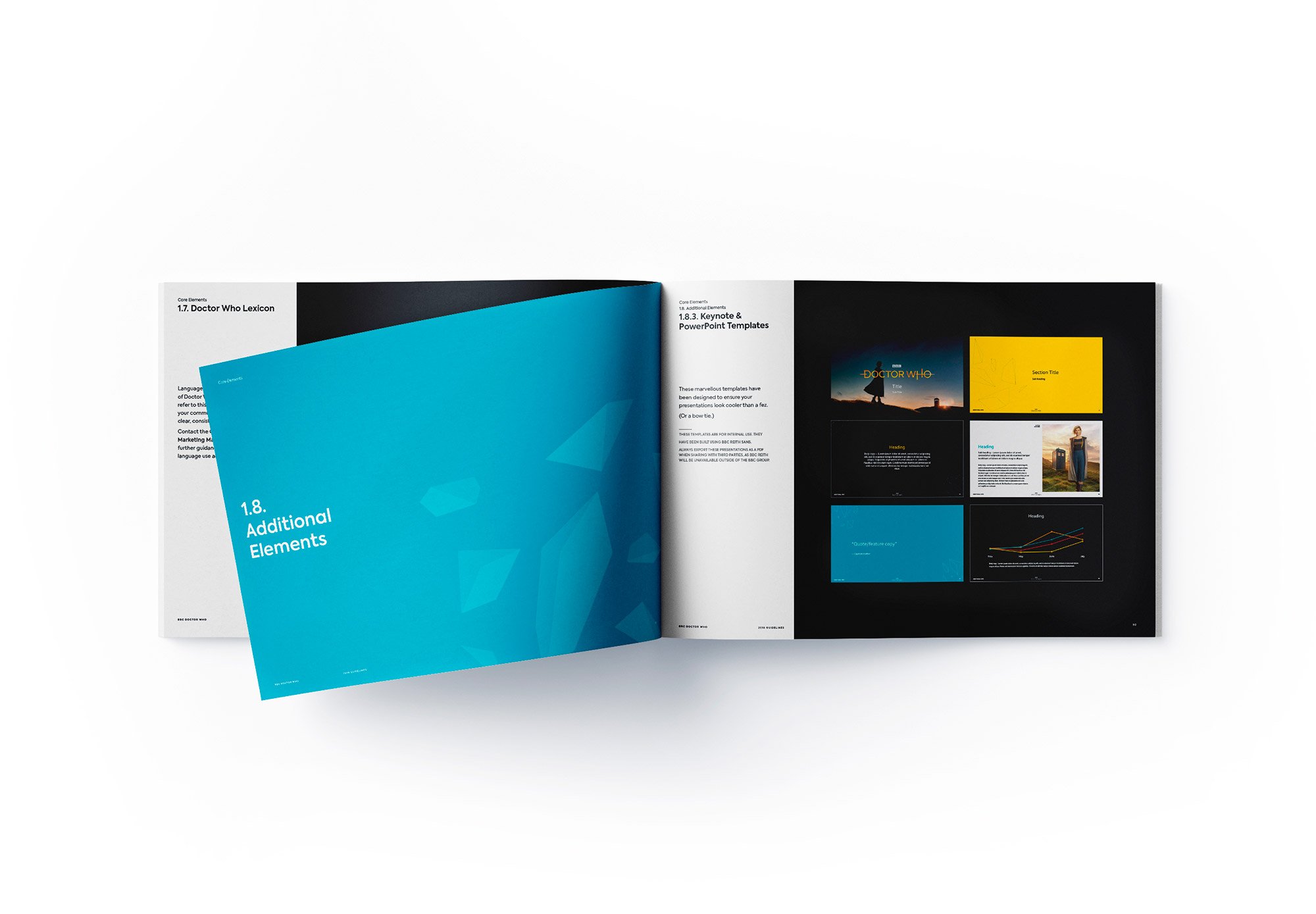
The overhaul of visuals, values, and tone of voice was comprehensive, hitting every touchpoint in English, Chinese, and Korean. For the first time, Doctor Who had a consistent style to bolster its brand equity.
STING: VISUAL AND SONIC BRANDING
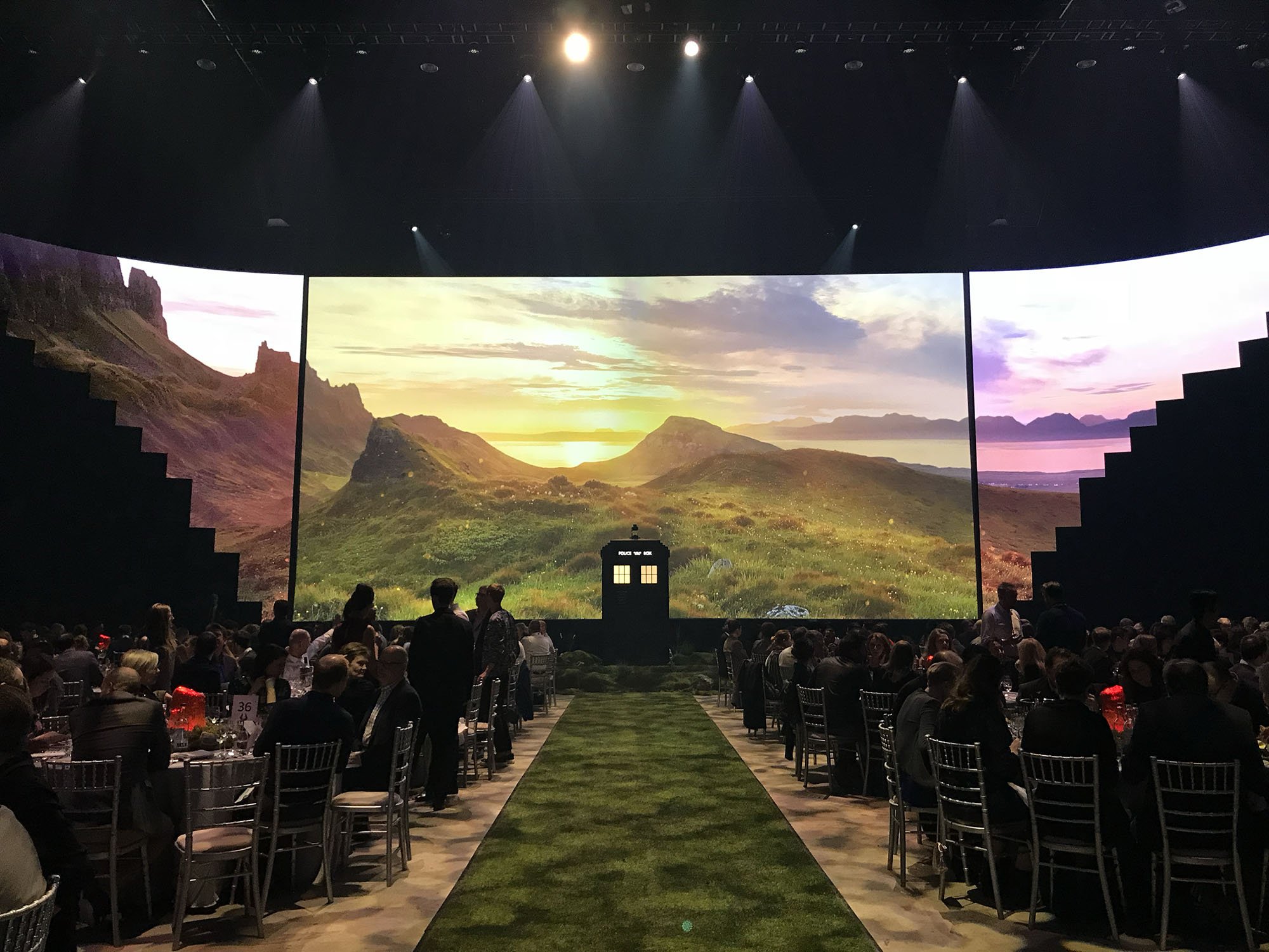
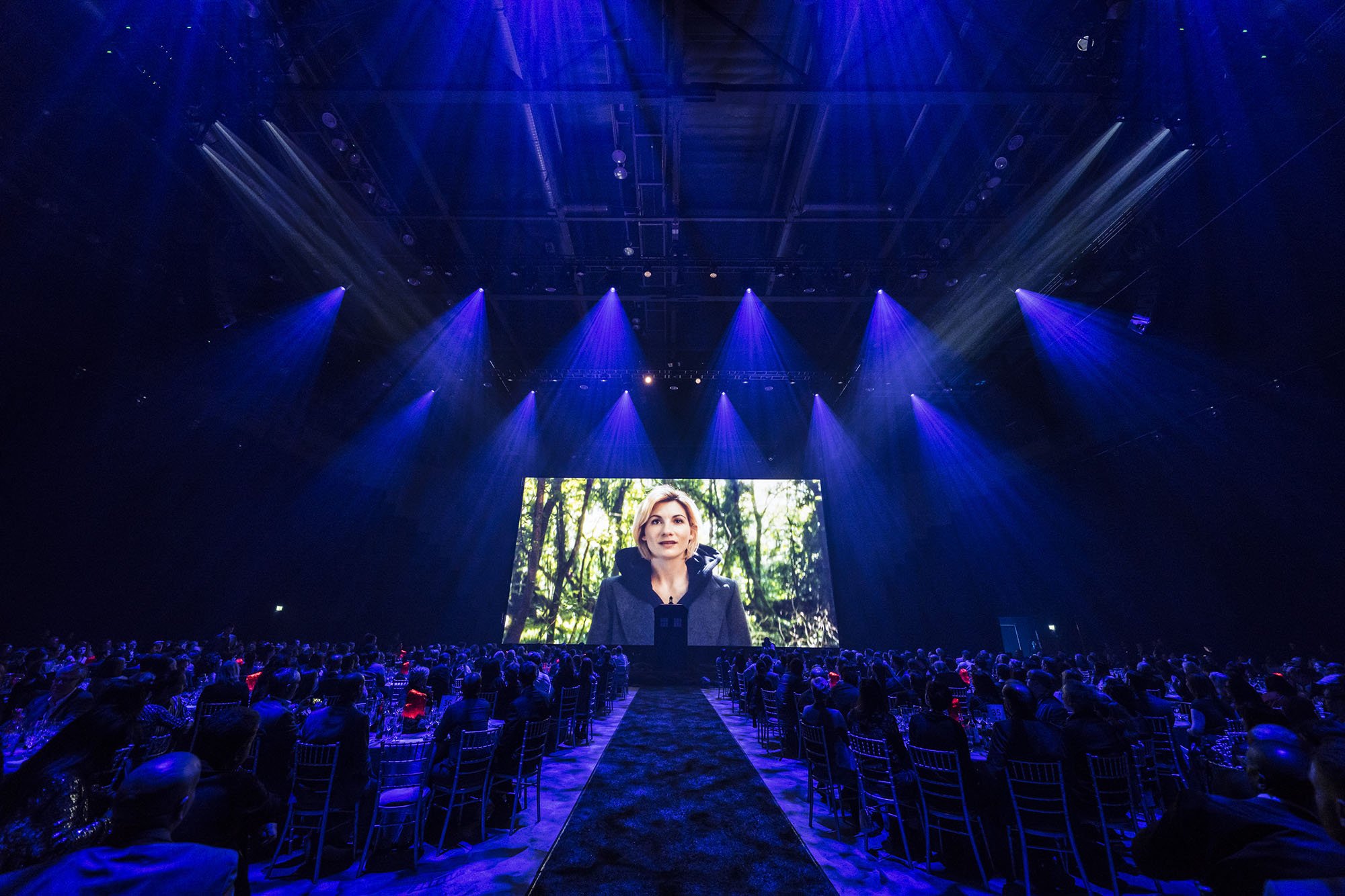
It launched simultaneously — live at BBC Studios Showcase in Liverpool and on international BBC channels and socials. The response from buyers and fans was overwhelmingly positive, the perfect dawn for a new Doctor.
MY ROLE: DESIGN DIRECTOR, CREATIVE DIRECTOR
BEFORE
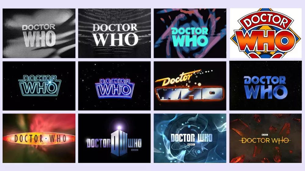
Two ‘official’ logos were in use at the time—the ‘classic’ on the left for legacy IP, and the current series logo for anything related to Peter Capaldi’s Doctor.
The existing design system relied on hexagons and a steel blue palette, which felt cold and technical, limiting expression across touchpoints.
The approach to key art and photography was limited by the design elements and colour palette.
AFTER
The new logo broke tradition with all those before it, featuring a clean, modern look that worked seamlessly with the current series and all previous Doctor Who IP.
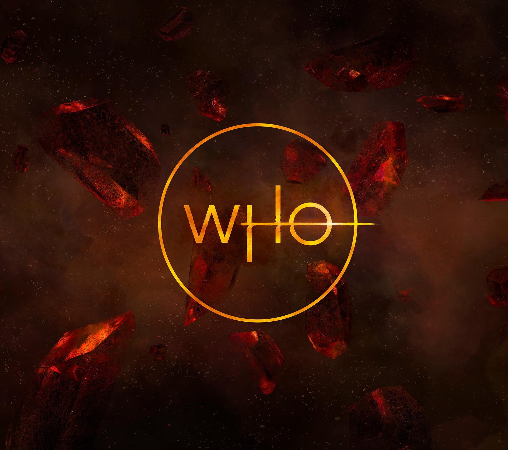
New, flexible design elements drew from the TARDIS’s crystal forms, with a broad colour palette to suit a wide range of consumer products.
The new brand paved the way for much greater freedom of expression, colourways and design features.
“What impressed me most was your strategic approach to the work. It’s rare that a creative can play back the key elements from a client brief and demonstrate such clear understanding of it.”
Philip Raperport, Head of Drama Franchise Marketing
BBC Studios








“A really brilliant, inspiring and standout process. It’s such a great representation and distillation of the show, as well as being its own beautiful iconic thing.”
Chris Chibnall, Showrunner
“The process was one of the most enjoyable parts of the journey — and doesn’t it look great on everything.”
Matt Strevens, Executive Producer


