Go Ape
REBRAND
As the UK’s top forest adventure company, Go Ape’s mission is to encourage everyone to ‘live life adventurously,’ mainly by climbing into the treetops and screaming all the way down.
After fifteen years, the brand needed a refresh. A significant drop in young adults, deterred by Go Ape’s family-friendly image, meant the new brand had to lure them back while still appealing to the core family market.
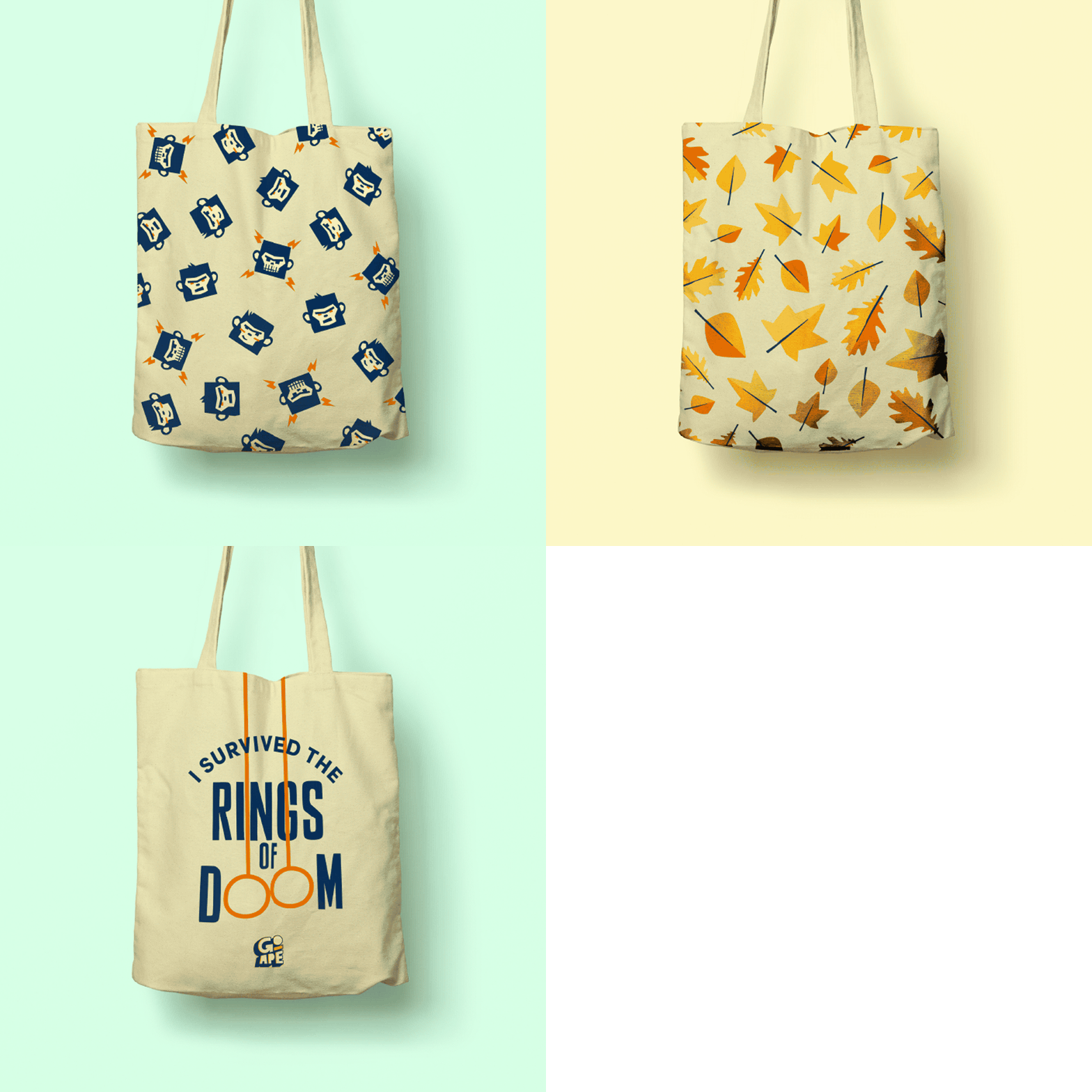
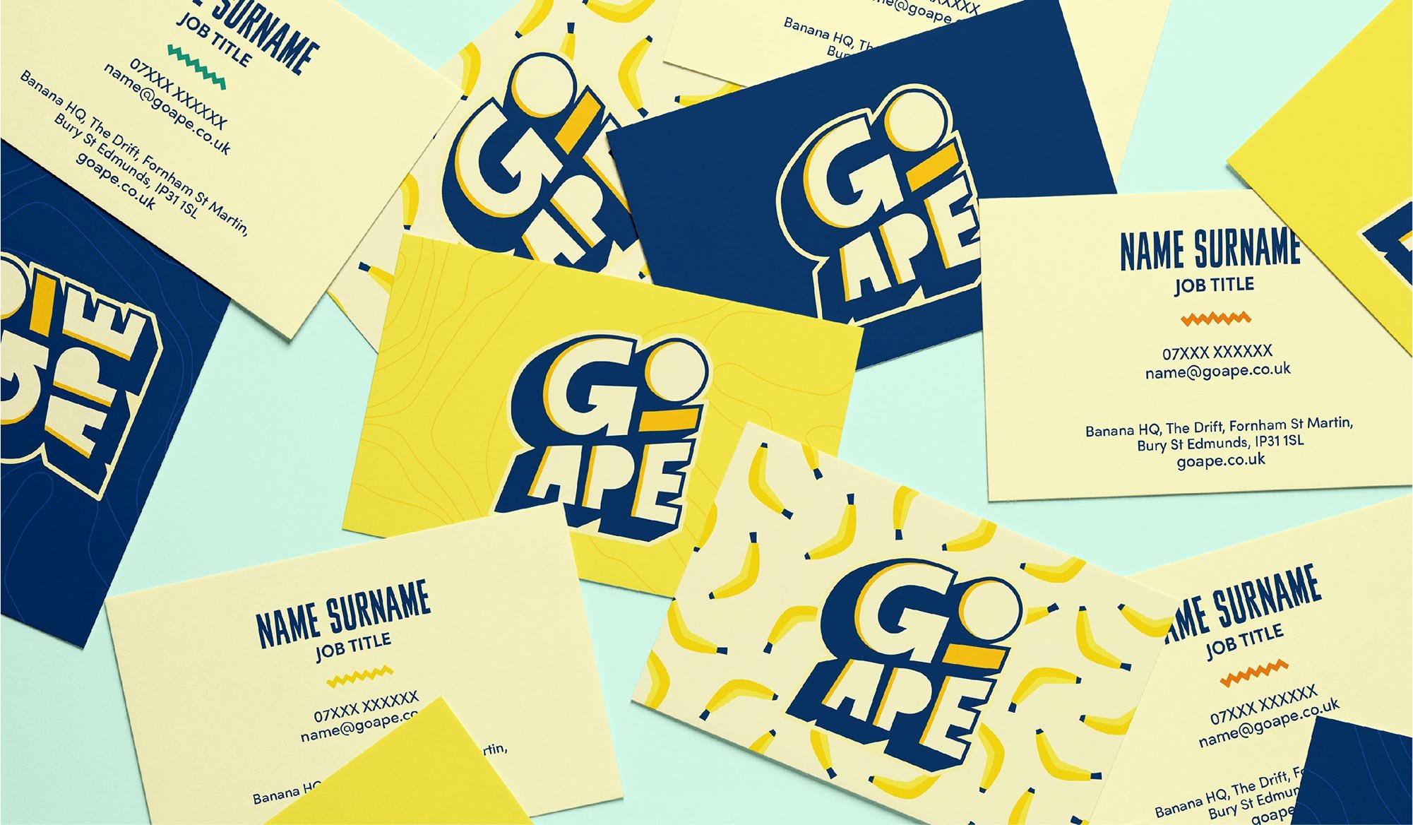
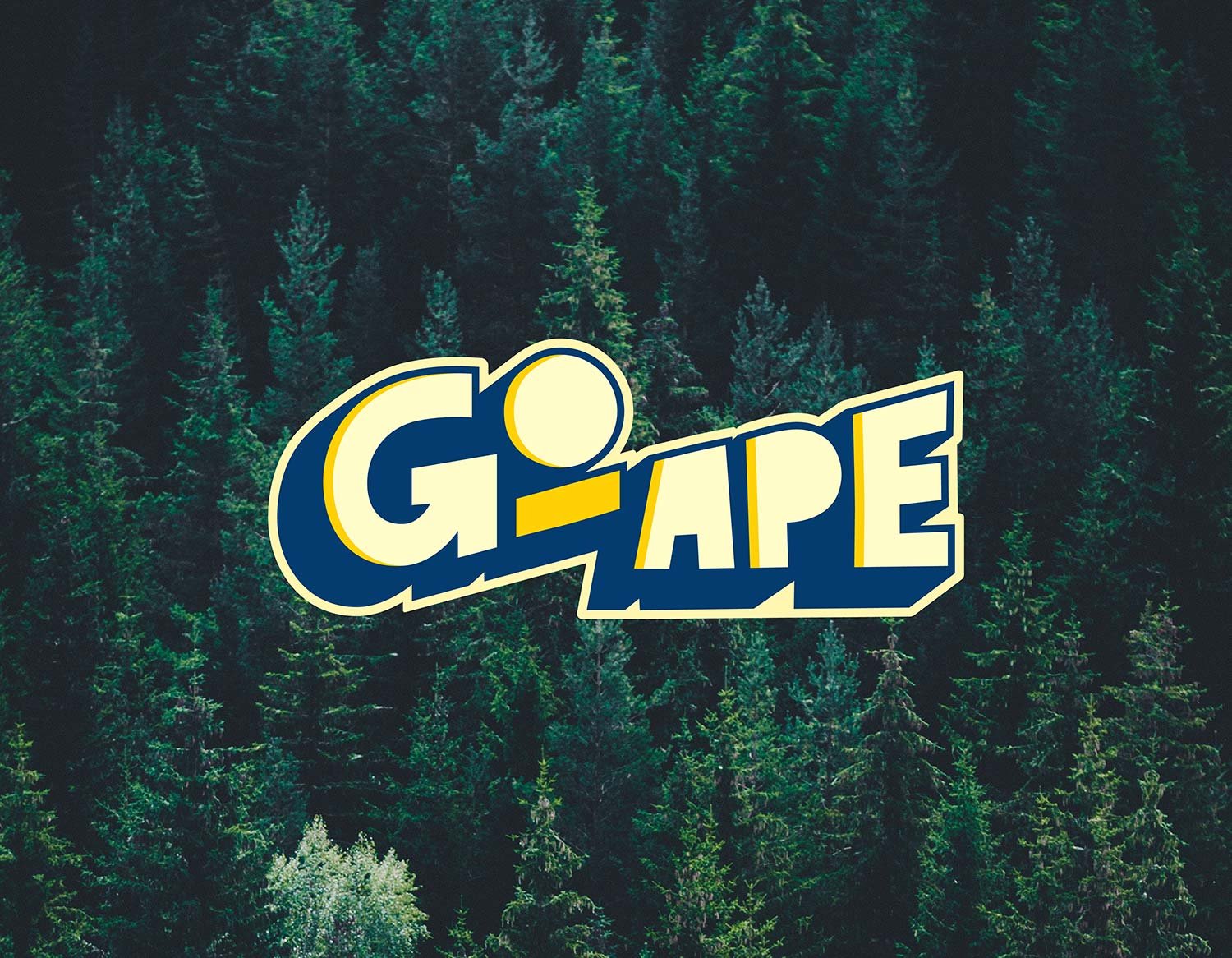
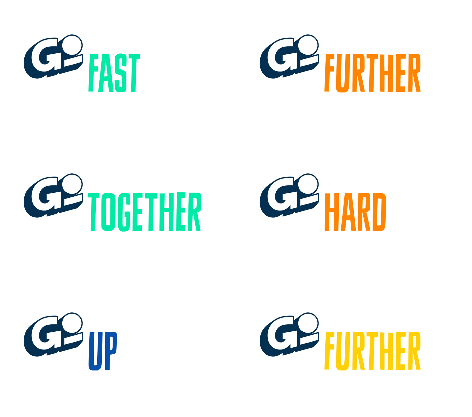
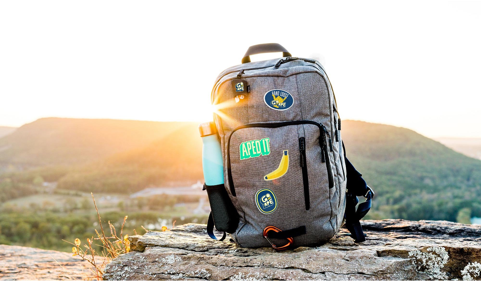
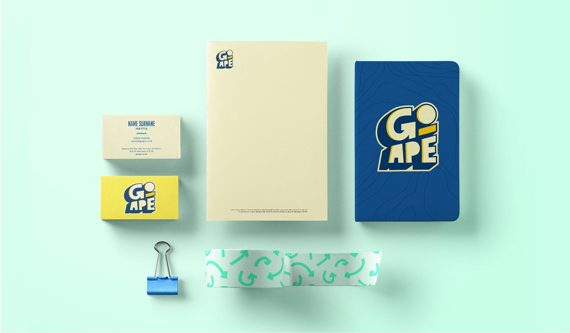
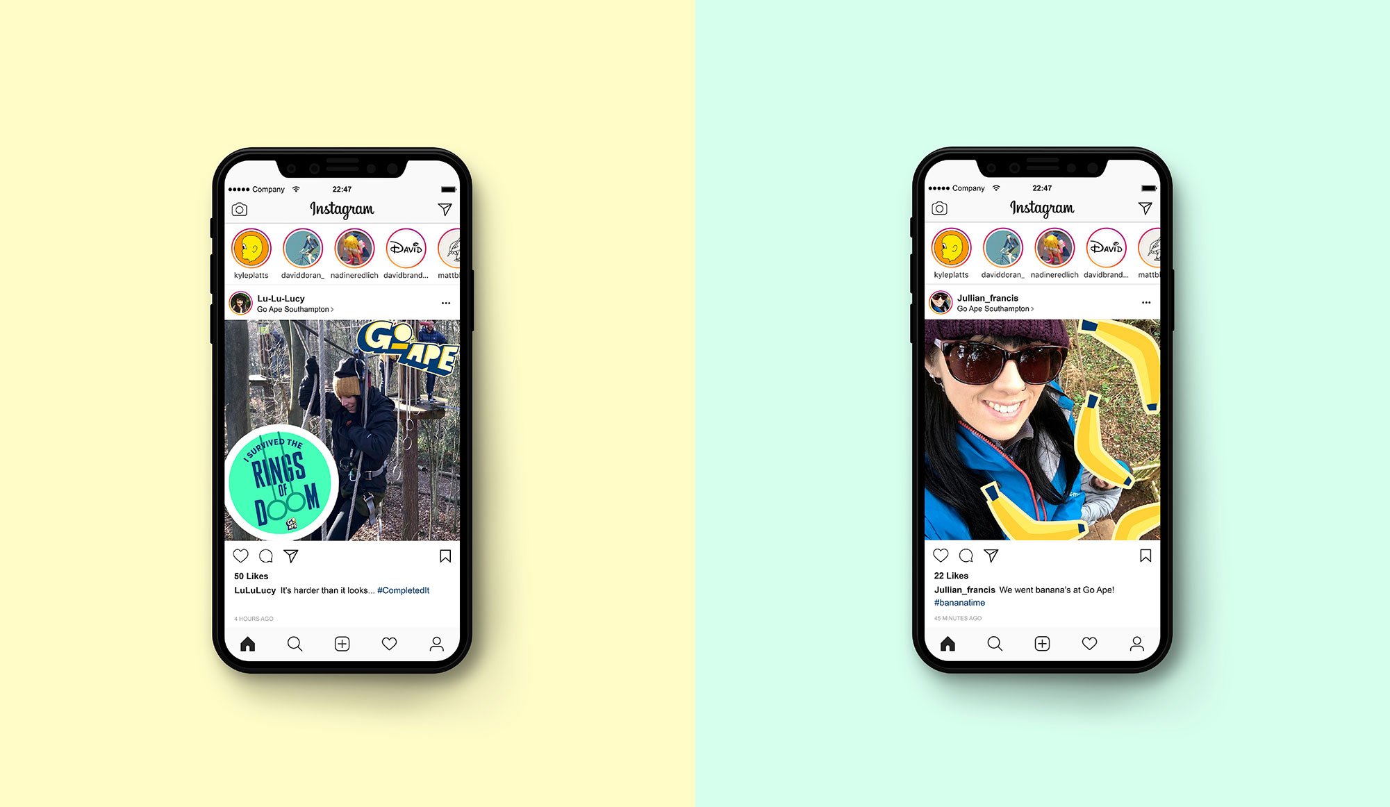
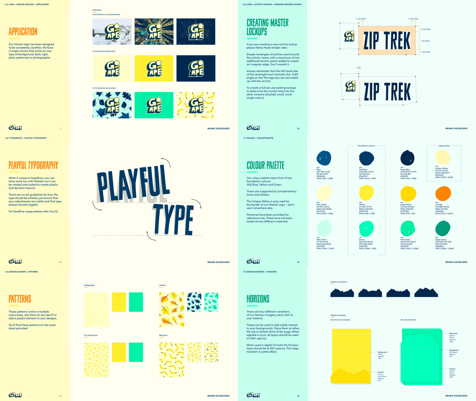
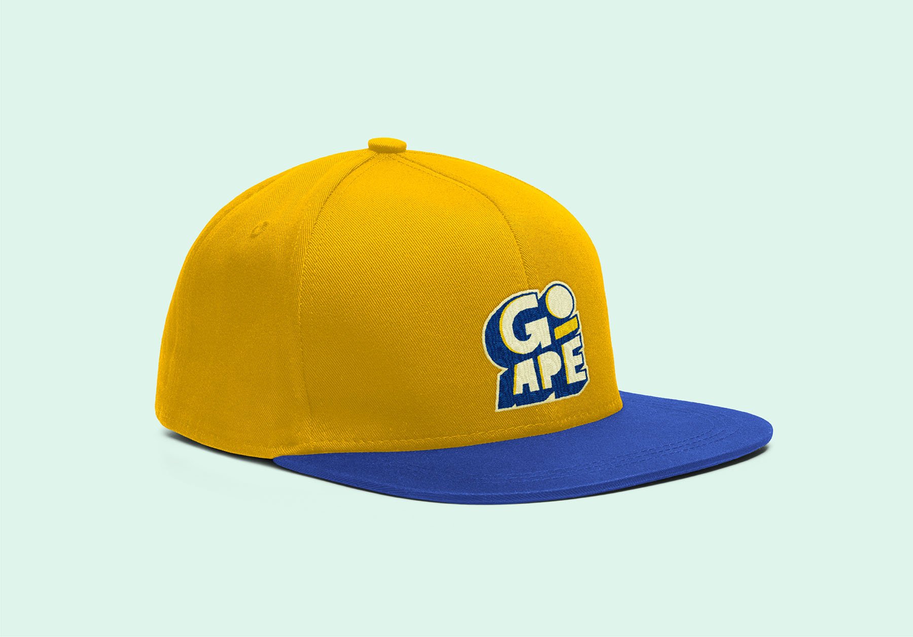
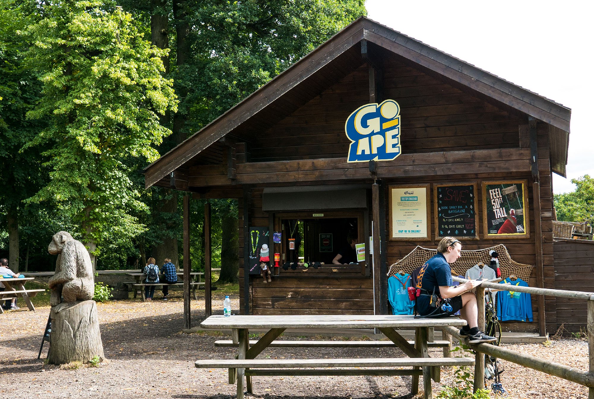
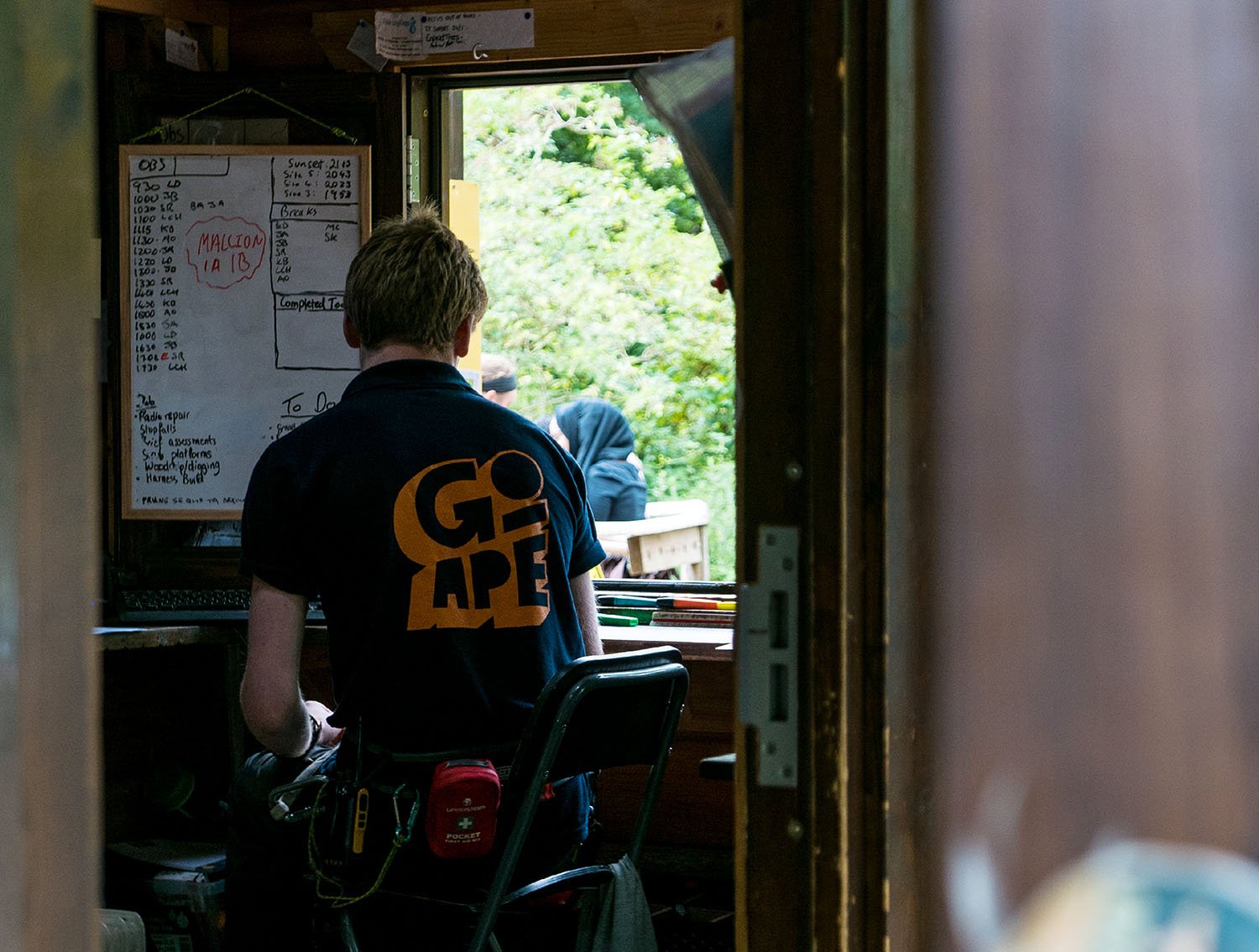
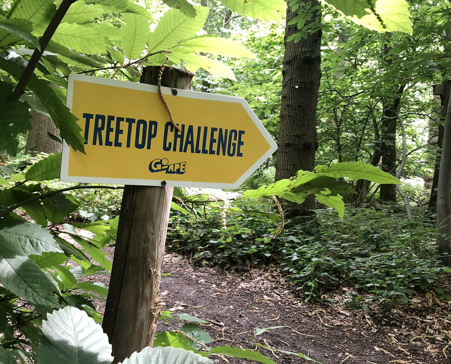
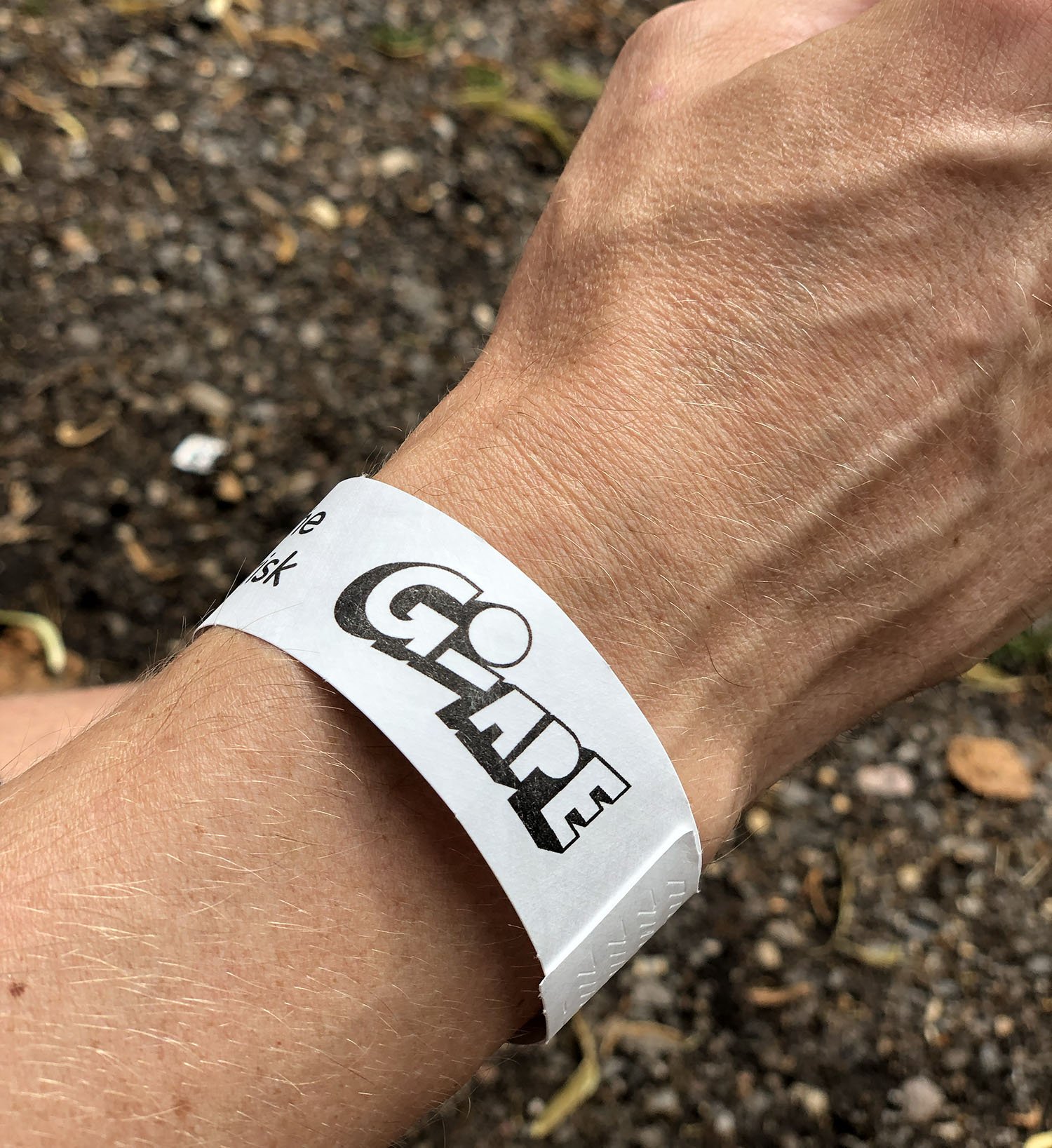
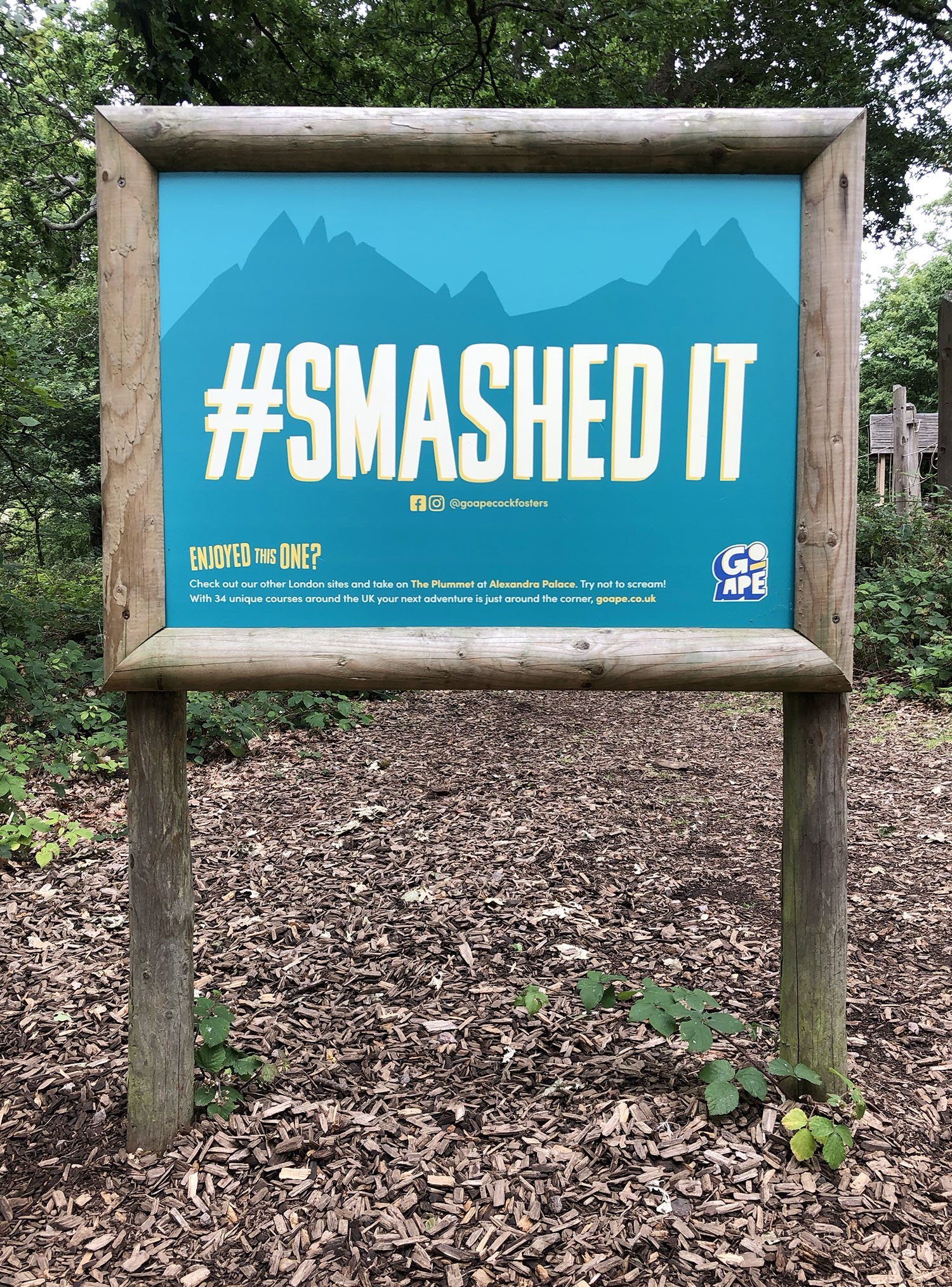
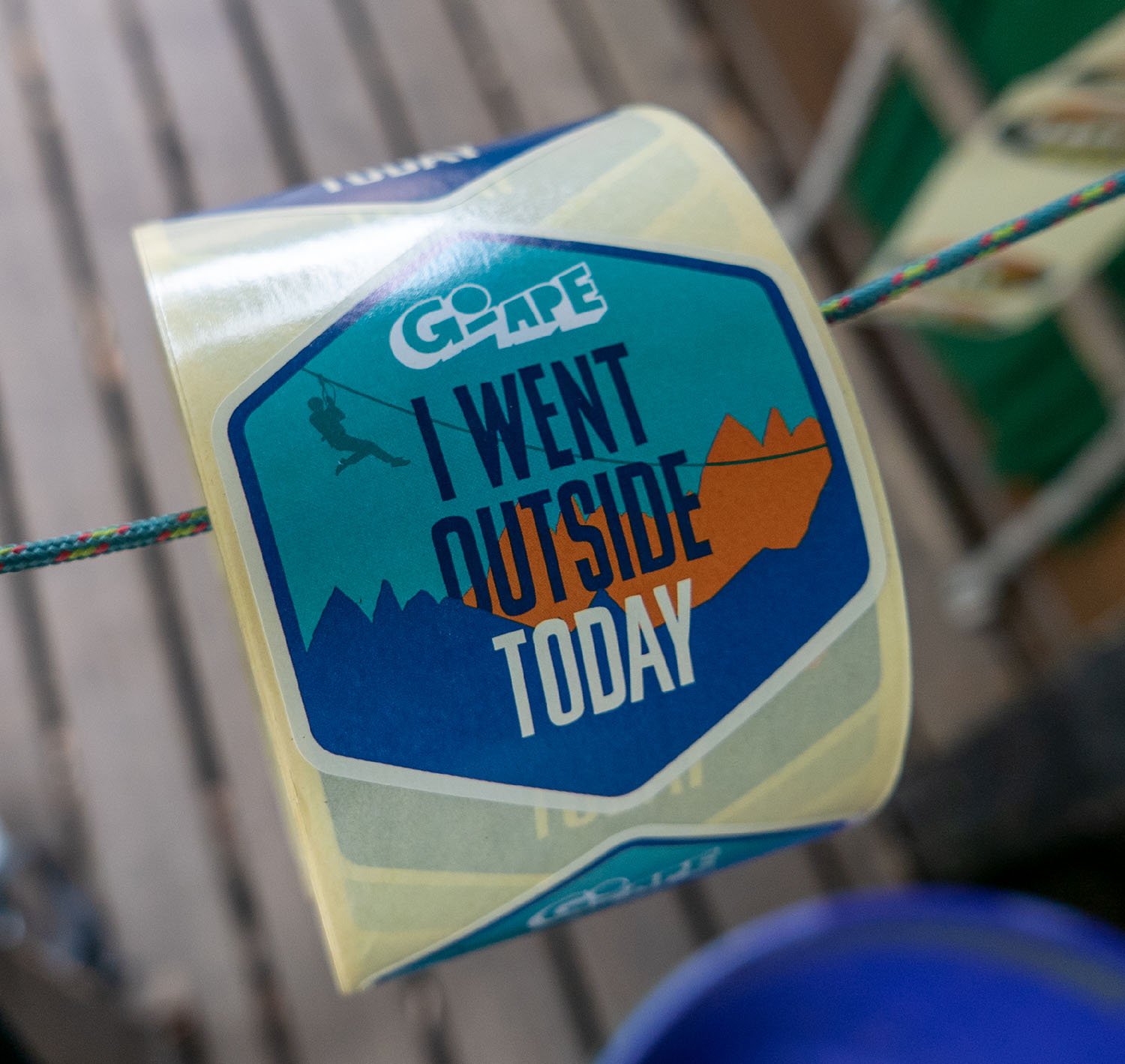
The design reflects Go Ape’s laid-back ethos — while being easy for their small in-house team to use. The single, sticker-style master logo can be used anywhere (doing away with dark vs light versions and concerns with busy backgrounds) plus a stencil logo for celebrating the seasons on social.
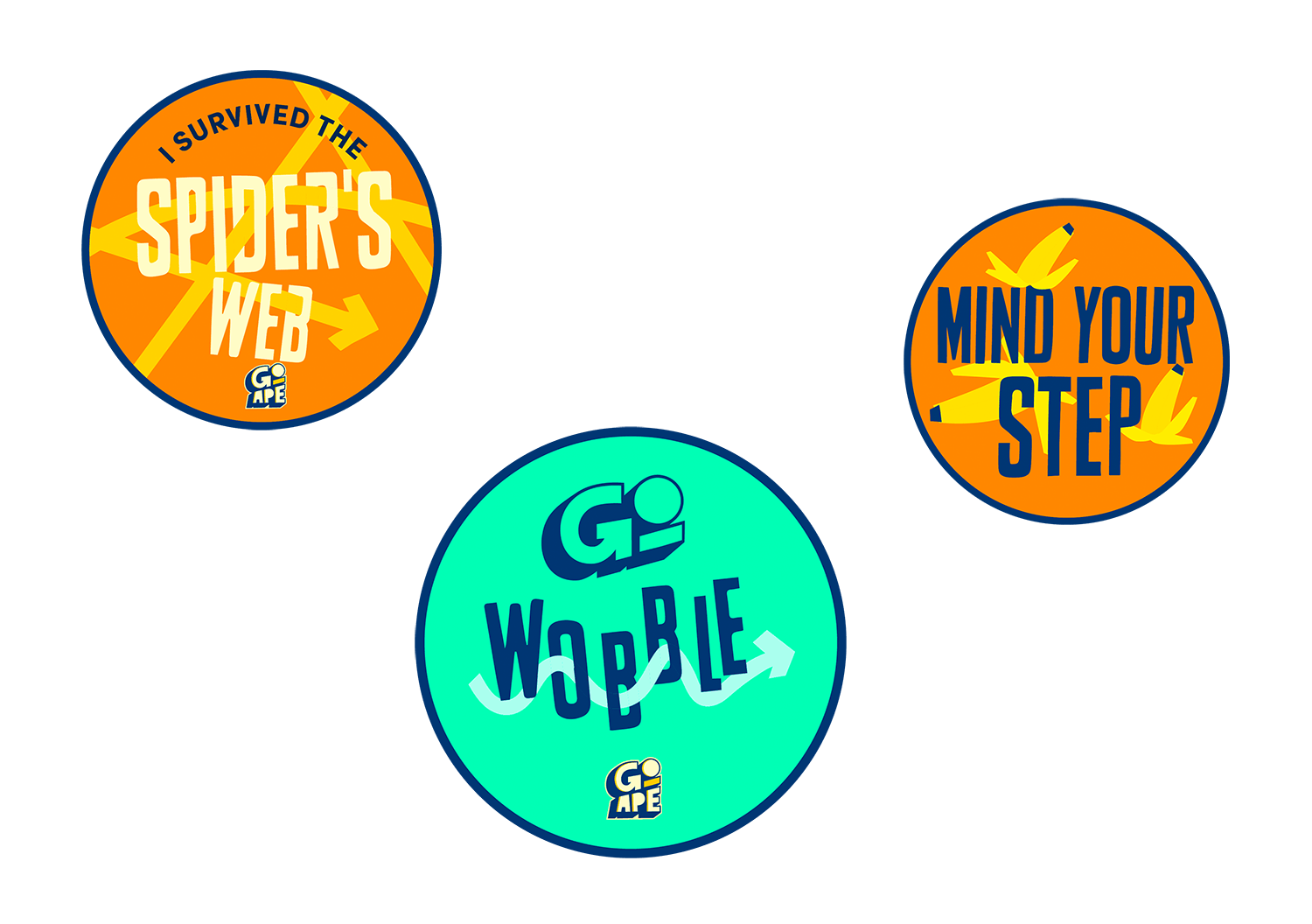
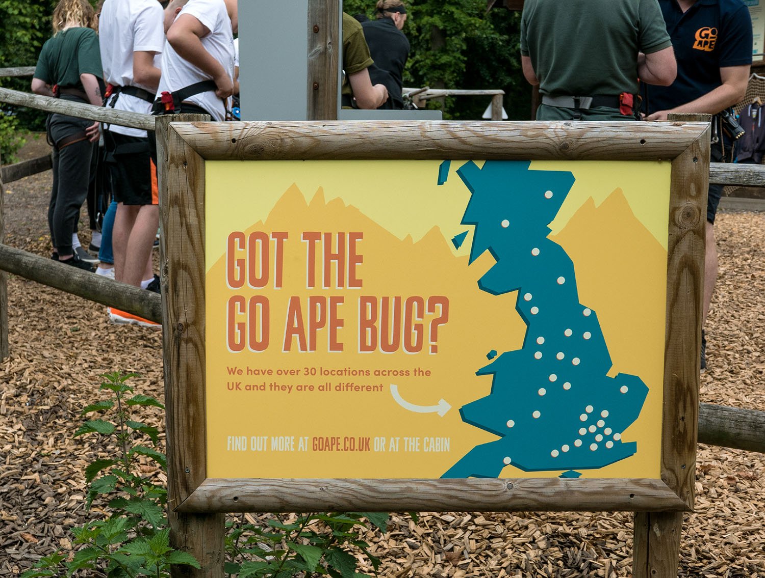
Every element of the brand is intentionally wonky, from the typeface to the assets and layout rules, making consistent and impactful brand-building easy and enjoyable for the team.
LOGO PRESENTATION
MY ROLE: DESIGN DIRECTOR, CREATIVE DIRECTOR




“You really took the time to get to know our brand. When you proposed creative changes, it came from a strategic understanding of where we are now versus where we want to be.”
Jo O’Boyle
Head of Marketing, Go Ape


