ITV
NETWORK REBRAND & LAUNCH
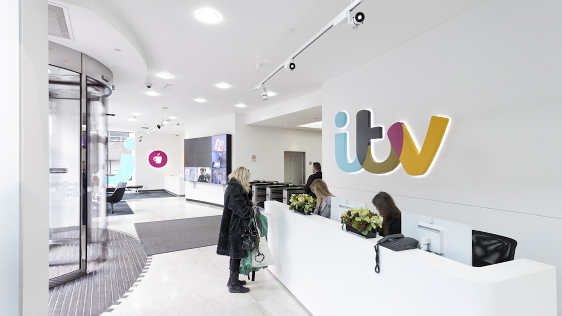
ITV’s game-changing rebrand was the most ambitious of any UK commercial broadcaster. It came at a time when a decline in quality dramas, the phone-voting scandals and ‘shiny-floor’ entertainment shows had tarnished ITV’s appeal.
The organisation set a bold new commissioning strategy and brand proposition, to be ‘the heart of popular culture,’ which required a dramatic new identity to reflect the change.
‘COLOUR-PICKING’ LOGO ON LAUNCH IDENTS
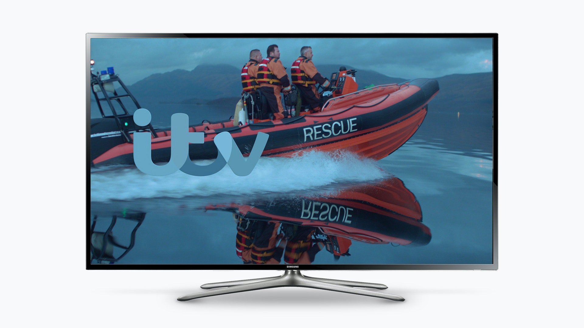
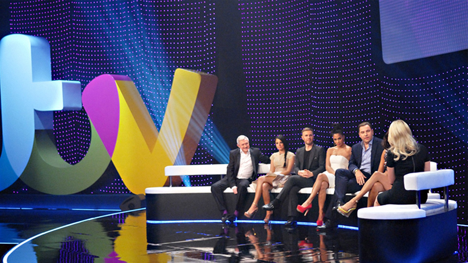
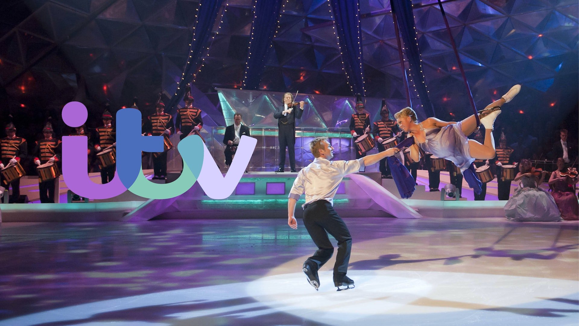
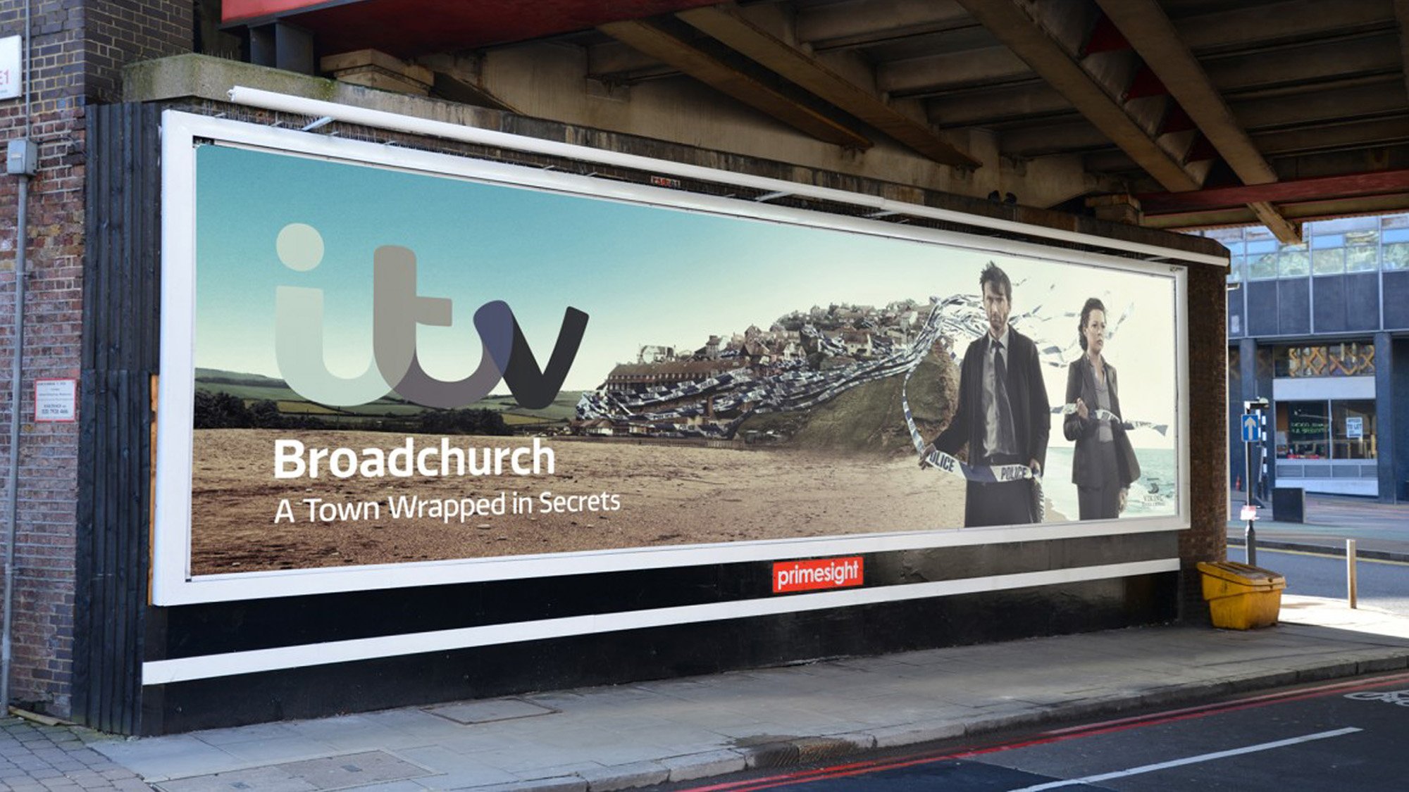
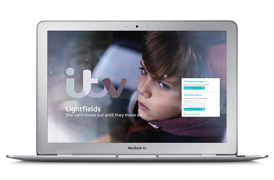
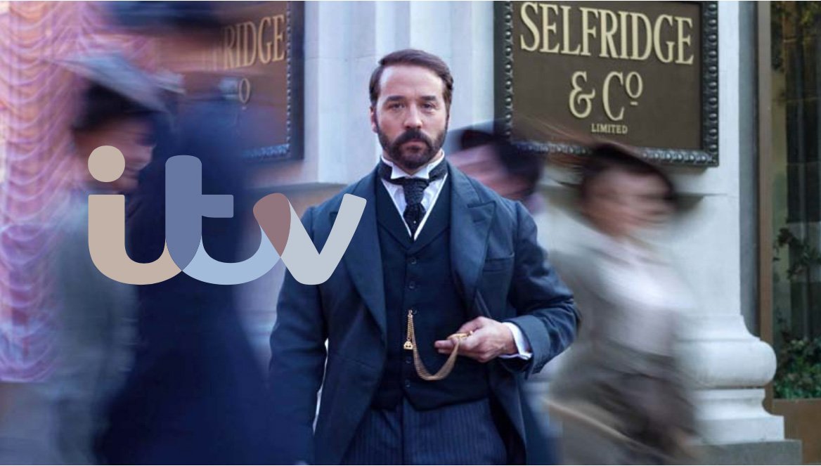
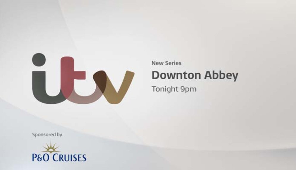
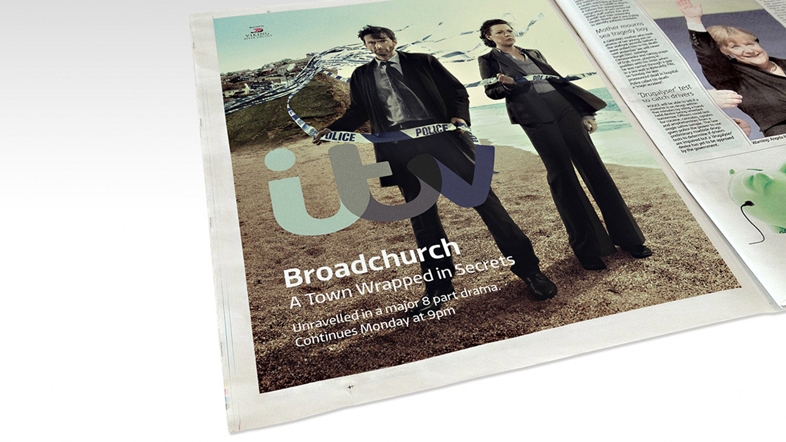
The ‘colour-picking’ logo reacted to content and integrated with programming. It spawned a range of ‘everyday life’ seasonal idents, making every promo and poster completely unique.
This was complemented by ‘channel flow’ — my concept for seamless on-screen presentation graphics across the portfolio, making the brand fluid and consistent at every touchpoint.
Built in-house at ITV Creative with Rudd Studio and Envy, the new identity significantly changed perceptions and brought audiences back to ITV.
Within a year, ITV1’s share of viewing increased, on-demand viewing was up 13%, and ad revenue rose by 11% in the third quarter. Best of all, YouGov’s brand tracker ranked ITV as the number-one commercial broadcaster for brand health and brand love.
AWARDS
Design Week • Brand of the Year
Cannes Bronze Lion • Best Logo and Visual Design
The Drum Marketing Awards • Rebrand Strategy of the Year
Silver IPA • Effectiveness Award
Promax Gold • Best Channel Identity
Gold MediaWeek • Media Brand of the Year
Transform Awards • Grand Prix Winner
LAUNCH VIDEO EXPLAINER
MY ROLE: CREATIVE DIRECTOR, DESIGNER, LEAD ANIMATOR
BEFORE
The previous design was a 3D-rendered ‘badge’ that sat atop content, lacking a connection to the content it was paired with.
The channel brands were inconsistently designed, with CITV and ITV2 lacking clarity at smaller sizes.
AFTER
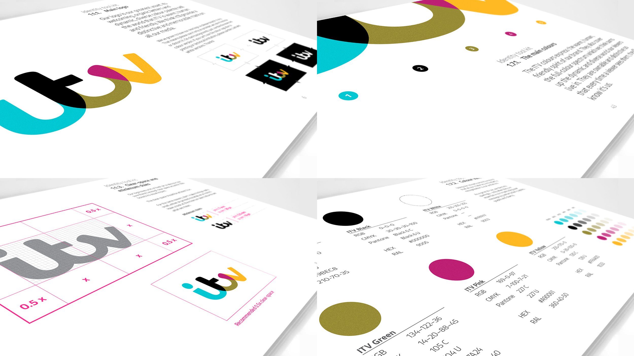
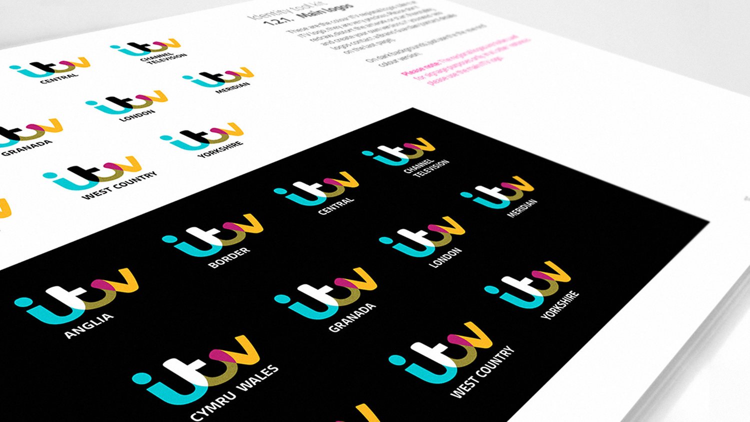
Hand-crafted, cursive forms made the logo more human while overlapped sections introduced a wealth of colour — along with a unique ‘colour-picking’ system unlike any brand before it.
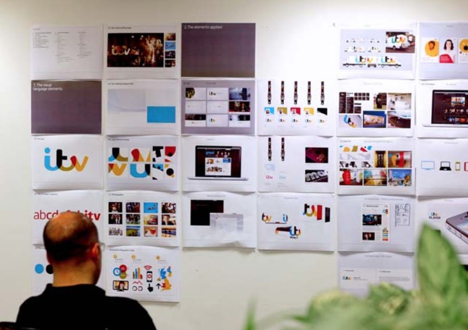
The new system was entirely cohesive. Channels were differentiated by colourway and on-air behaviour.






“An amazingly intense amount of work, expertly carried out.”
Brand New / Underconsideration Review


